01 / THE CHALLENGE
The visitor may be using it for the first time.
A kiosk has to explain the next step without a walkthrough. It also has to work when a PIN is wrong, a visit is outside its schedule, or the visitor needs help from a resident.
The interface sits between a person and a physical access system. A success message must correspond to the actual entry state; a failure message needs a practical next step.
02 / MY ROLE & APPROACH
Designing for the moment of arrival.
I focused on the visitor’s immediate task at each step of arrival. That meant keeping input screens direct, making verification results understandable, and providing a route to host assistance.
Project timeline · design phases
- 01
Frame the task
Start with arrival and the available entry methods.
- 02
Organize the experience
Map verification and the route to host assistance.
- 03
Resolve the interface
Design focused touch screens and exception states.
- 04
Prepare for execution
Review the interface in its physical device context.
03 / INFORMATION ARCHITECTURE
A short path through entry.
The main areas of the product, and the information each one needs to keep together.
Arrival
- Welcome
- PIN entry
- Verification
Access response
- Success state
- Invalid credentials
- Outside schedule
Assistance
- Resident directory
- Find a host
- Contact flow
04 / USER FLOW
From the welcome screen to an access result.
A useful flow needs to account for what happens when someone cannot take the next step immediately.
- 01Start arrival
- 02Enter credentials
- 03Review the result
- 04Enter or contact a host
Verification does not succeed?
Explain the result and offer the available route to host assistance.
05 / DESIGN DECISIONS
Clear actions at every step.
Keep input focused
PIN and verification screens isolate the immediate task. The visitor gets a clear prompt rather than a dense dashboard of options.
Make unsuccessful states useful
Failed verification, denied access, and out-of-schedule states need to explain what happened and what can happen next. They are part of the main journey.
Provide a route to a person
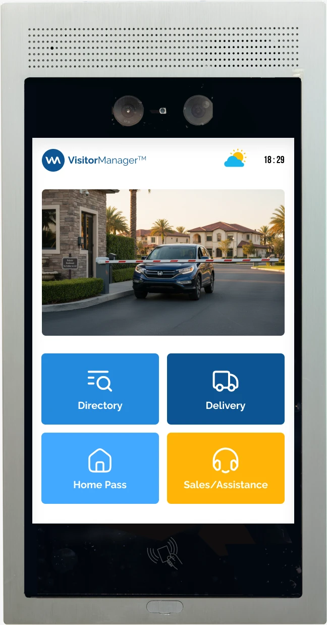
The resident directory and host-contact flow offer an alternative to self-service verification. The supplied device mockup shows the interface in its physical setting.
06 / THE WORK
From arrival to access.
Map entry and its exceptions
The original flow artifact lays out the arrival options and the conditions that shape what happens next.
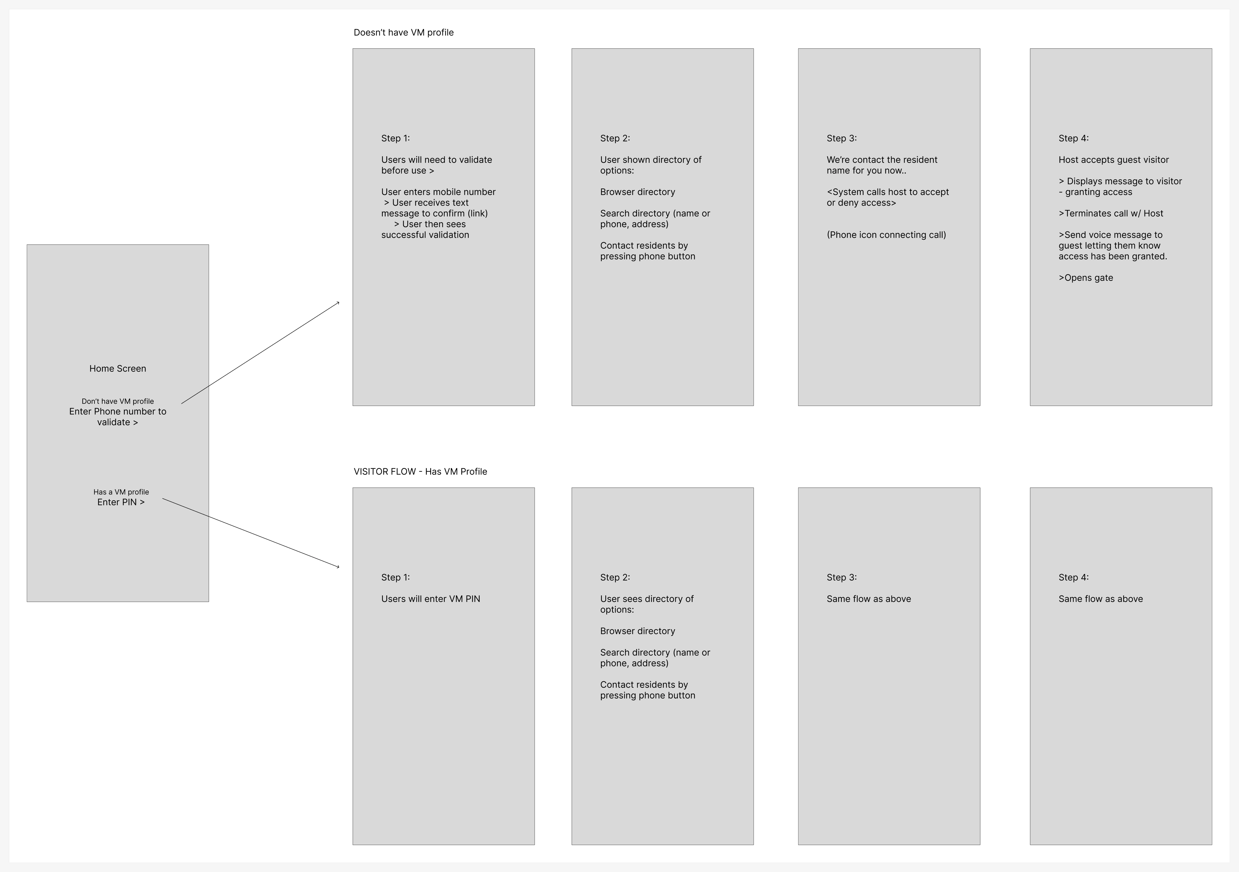
The Figma planning board captures the entry routes before they become individual screens.
View screen ↗One task per screen
Visitors need to understand the next action quickly. Verification and unsuccessful states keep attention on the immediate task.
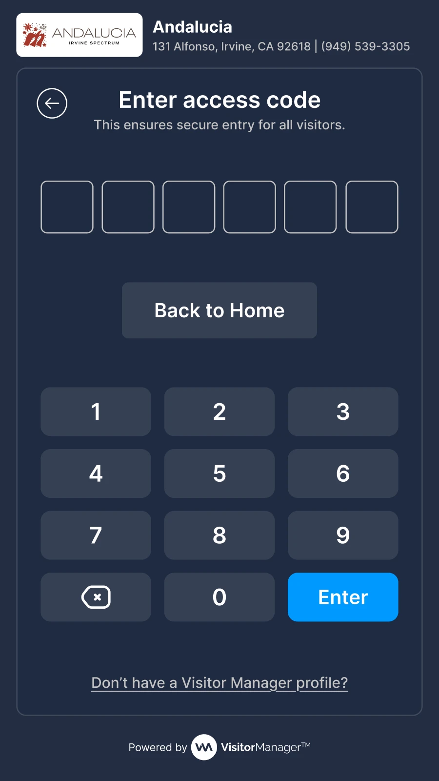
A focused keypad and prompt support credential entry.
View screen ↗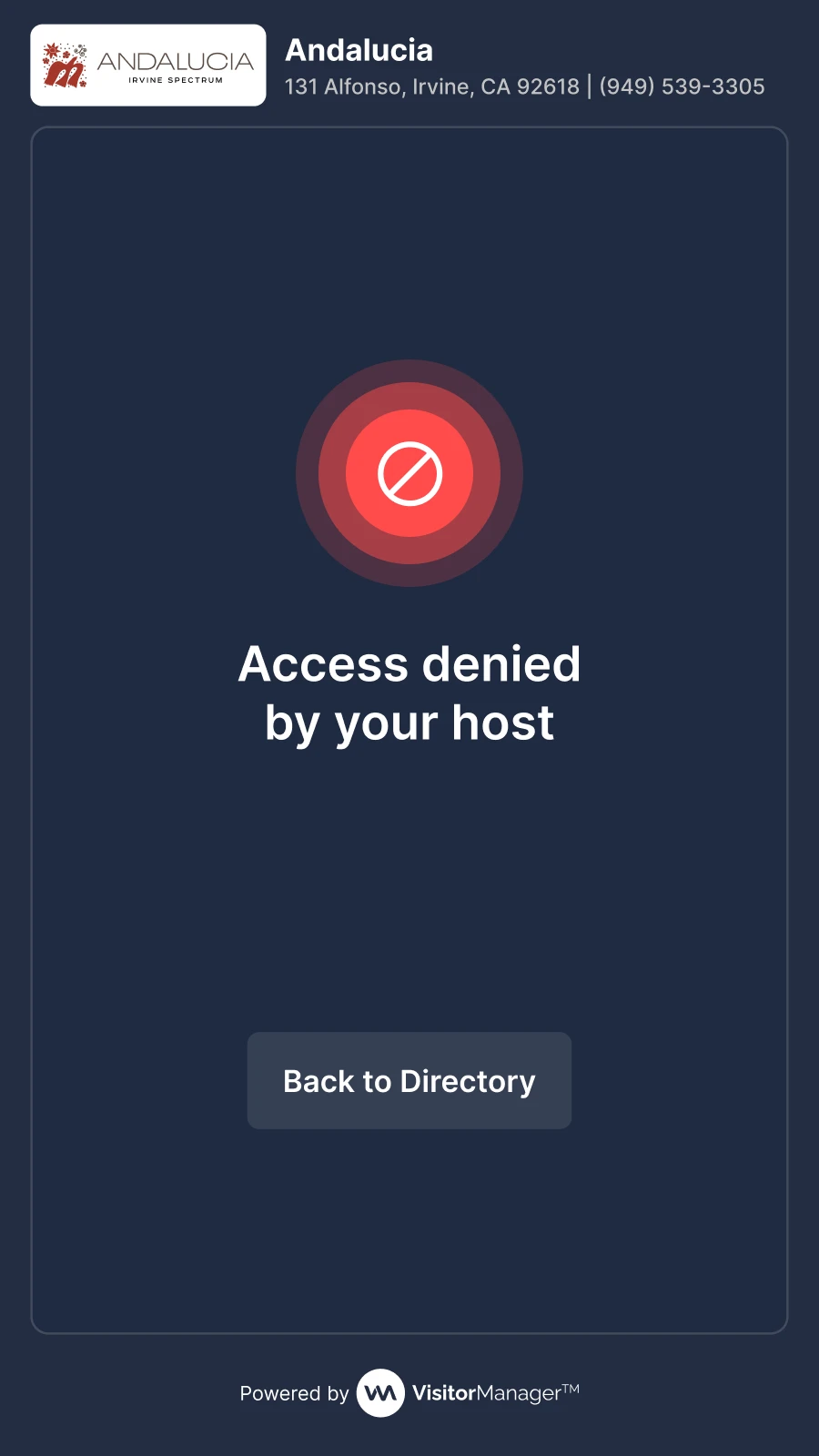
The interface gives the unsuccessful result a clear, dedicated state.
View screen ↗Offer help and confirm the result
The Orchard Hills iteration explores the resident directory and the successful entry state. The interface connects the screen action with the visitor’s next physical step.
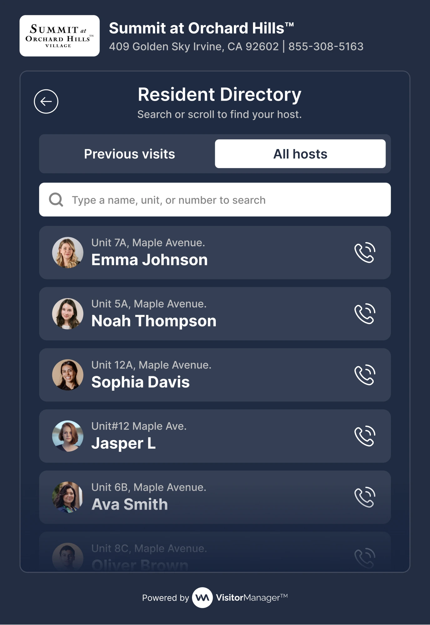
Names and calling actions provide a route to a host.
View screen ↗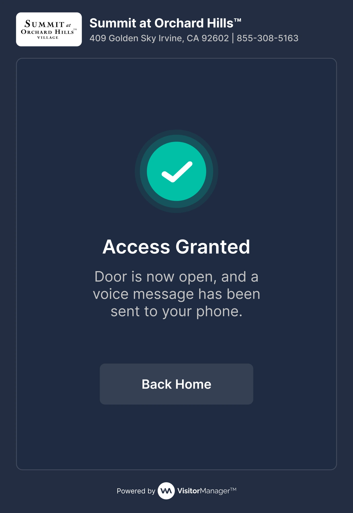
A prominent confirmation explains that the door is open.
View screen ↗07 / DESIGN INTO DEVELOPMENT
Touch, feedback, and a clean reset.
A touch interface needs generous targets and clear focus, but it also needs to respond to the real device. Timeouts, retry behavior, and the transition from verification to physical access should be agreed with engineering and checked on installed hardware.
08 / REFLECTION
The screen is only part of the experience.
This work brings verification and assistance into the arrival flow. Reach, glare, keypad accuracy, and the relationship between the screen and the door need to be checked on the installed hardware.
I would check reach, glare, keypad accuracy, recovery after a mistyped PIN, and the clarity of denied-access instructions on the installed hardware. These require on-device testing.