01 / THE CHALLENGE
First explain what the product is for.
The audience includes developers, agencies, and teams responsible for a website. The page needs to introduce the offer before asking people to work through the stack and its capabilities.
The technical detail needs to support understanding rather than become an inventory. The sequence matters: proposition first, then the offering, then the reasons it may fit a team’s needs.
02 / MY ROLE & APPROACH
Finding a clear sequence for the product story.
I developed the landing-page concept and its visual hierarchy. The main task was turning a technical offering into a readable sequence, with distinct explanations of the framework, cloud service, and support.
Project timeline · design phases
- 01
Frame the task
Clarify the platform and the people it is intended for.
- 02
Organize the experience
Separate the proposition, offerings, and supporting detail.
- 03
Resolve the interface
Develop illustrations and the long-form page rhythm.
- 04
Prepare for execution
Review calls to action and technical terminology.
03 / INFORMATION ARCHITECTURE
An introduction that leads to action.
The main areas of the product, and the information each one needs to keep together.
Introduce
- Frontend proposition
- Platform overview
- Starting action
Explain the offer
- Framework
- Cloud
- Concierge
Establish fit
- Technology ecosystem
- Features
- Audience-specific content
04 / USER FLOW
From the first impression to the next step.
A useful flow needs to account for what happens when someone cannot take the next step immediately.
- 01Understand the proposition
- 02Explore the offering
- 03Check fit
- 04Start or talk to the team
Unsure which offer fits?
Use Framework, Cloud, and Concierge as separate entry points into the explanation.
05 / DESIGN DECISIONS
Explaining the offer in stages.
Start with the frontend proposition
The hero introduces the product and a starting action. The illustration gives the abstract platform story a visual entry point.
Separate the three offerings
Framework, Cloud, and Concierge have distinct positions. That helps visitors understand the difference between the product, hosting, and support.
Explain who each part is for
The page moves through the ecosystem and features toward audience-specific sections. Developers, agencies, and digital teams get a route into the same product story.
06 / THE WORK
A closer look at the details.
Explore the screens below. Scroll through a longer page or open it for a closer look.
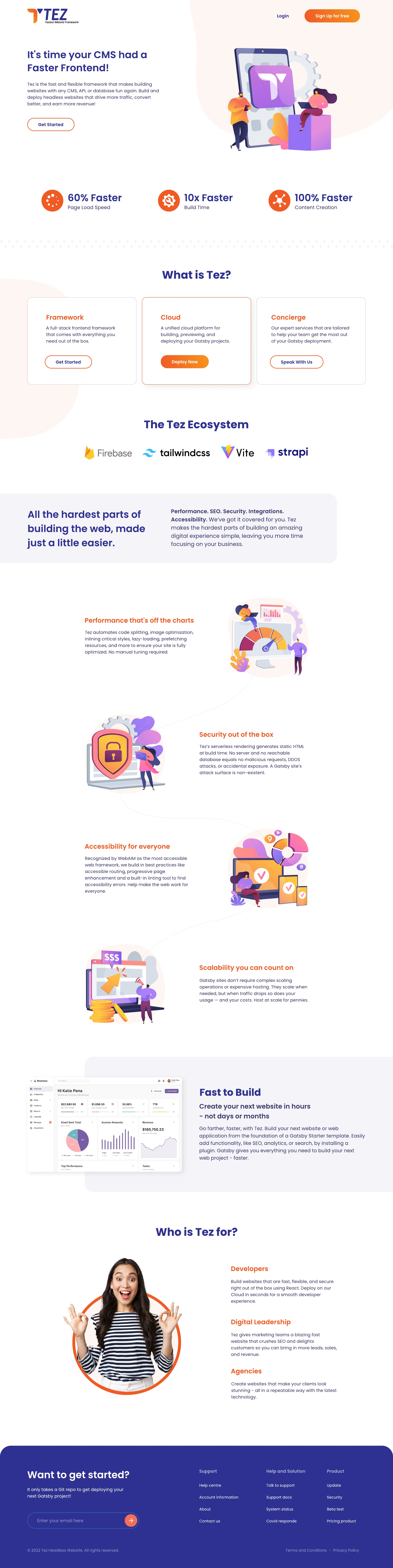
Scroll from the proposition through Framework, Cloud, Concierge, features, and audience-specific content.
Open full design ↗07 / DESIGN INTO DEVELOPMENT
Carrying the visual hierarchy into the build.
A long page benefits from reusable sections, lightweight illustrations, and clear heading structure. The final build should preserve reading order on smaller screens and keep the primary action visible without overwhelming the technical explanation.
08 / REFLECTION
A starting point for the product story.
This is a website concept, including exploratory marketing copy. Performance figures in the source artwork are not results of this design work. Product terminology and technical claims need confirmation before the concept becomes a live product page.
I would test whether visitors can explain Framework, Cloud, and Concierge after reading the page. Technical and comparative claims should be checked with product and engineering before publication.