01 / THE CHALLENGE
What happens after the answer?
An assistant can help create something in a conversation, but people still need to find it, change it, or remove it later. AI Buddy explores that second part of the experience as well as the chat itself.
Chat is a useful starting point, but it is not always the best place to manage a collection. The design lets conversation and structured views do different jobs.
02 / MY ROLE & APPROACH
Connecting chat with everyday tasks.
I focused on the experience around the conversation: where a task or note starts, how it is organized, and how someone finds it again. The work connects conversational UI with more familiar content-management patterns.
Project timeline · design phases
- 01
Frame the task
Frame the assistant around useful everyday tasks.
- 02
Organize the experience
Connect chat creation with organized saved content.
- 03
Resolve the interface
Design conversation, calendar, and note screens.
- 04
Prepare for execution
Consider retrieval, editing, and deletion behavior.
03 / INFORMATION ARCHITECTURE
Chat, with a place for saved work.
The main areas of the product, and the information each one needs to keep together.
Create
- Conversation
- Suggested starting actions
- Tasks, notes & reminders
Organize
- Task calendar
- Saved notes
- Filters & content menus
Account
- Onboarding
- Sign-in & recovery
- Account settings
04 / USER FLOW
From a request to a saved task.
A useful flow needs to account for what happens when someone cannot take the next step immediately.
- 01Choose a starting action
- 02Add context
- 03Review the output
- 04Find it again
Need the output later?
Return through tasks or notes instead of retracing the conversation.
05 / DESIGN DECISIONS
Making the answer actionable.
Give the first prompt some direction
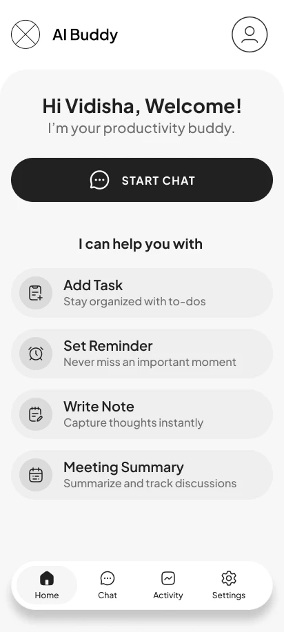
Task, reminder, note, and meeting actions show what the assistant is for. They offer a starting point without requiring the user to invent a prompt from scratch.
Give saved work a home
Task and note views organize material outside the conversation. Calendar views and filters support returning to it as the collection grows.
Cover routine account and content states
Onboarding, sign-in, password recovery, content menus, and deletion confirmations extend the design beyond the first successful interaction.
06 / THE WORK
Beyond the chat window.
Explore the conversation in wireframes
These early screens work through the conversation before the final visual treatment. The chat needs to be useful before someone has built up a library of tasks or notes. Suggested actions give the first exchange direction; response controls make the answer usable.
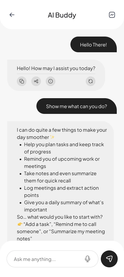
A greeting, a clear input, and concrete examples of what the assistant can help with.
View screen ↗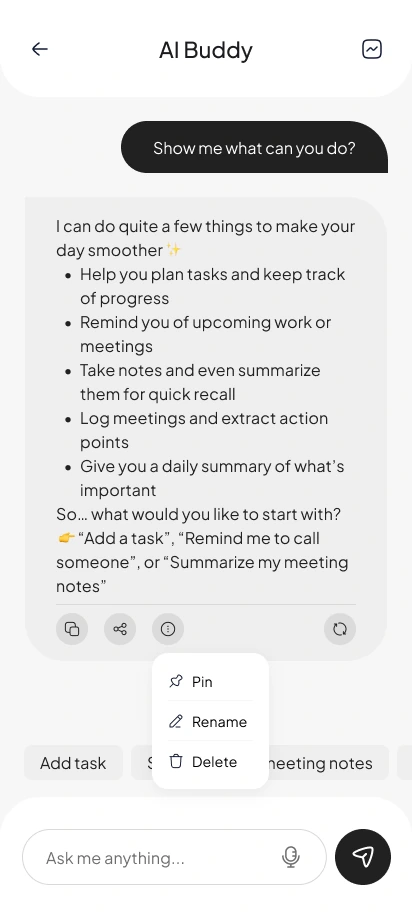
Pinning, renaming, and deleting live close to the content they affect.
View screen ↗Give each kind of work the right controls
A reminder needs a time. A meeting needs a date, participants’ context, and preparation. These details are easier to edit in focused forms than in a long conversation.
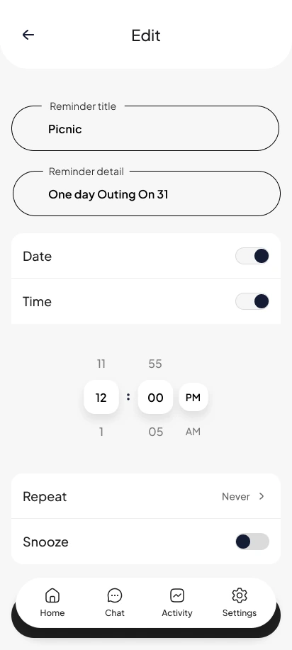
Date, time, repeat, and snooze controls sit within one editing task.
View screen ↗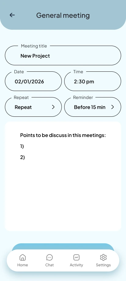
The meeting form brings the title, date, time, and discussion points together.
View screen ↗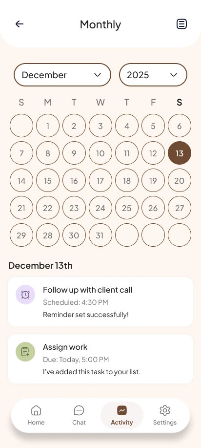
The calendar connects a selected day with its reminders and tasks.
View screen ↗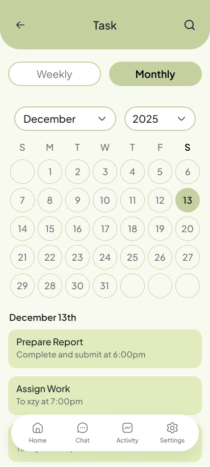
A dedicated task view gives saved work a predictable place outside chat.
View screen ↗Keep saved content within reach
Finding a note is a different task from creating one. Filters and a consistent list pattern help the collection remain useful as it grows.
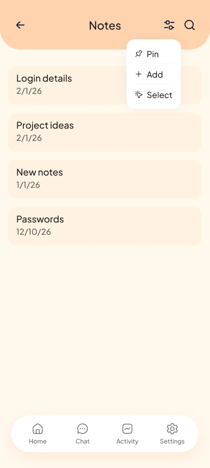
The saved-content view supports scanning and narrowing the list.
View screen ↗07 / DESIGN INTO DEVELOPMENT
Keeping chat and saved content in sync.
A conversation needs clear pending and failed-response states. Saved tasks and notes need their own loading and empty states, while deletion should make its scope clear. These details determine whether chat and structured views feel like one product.
08 / REFLECTION
A useful answer needs a useful home.
The concept connects creation with retrieval and editing. The next design question is how clearly people understand what has been saved, what remains in a chat, and what will be removed by a delete action.
I would test whether people know where an AI-created task is saved, can revise an incorrect result, and understand the difference between deleting a chat and deleting saved content.