01 / THE CHALLENGE
A quick answer should still be understandable.
Calcuverse is my personal project, planned, designed, and developed entirely by me. It brings everyday calculators and utilities into one place, covering money, health, dates, conversions, documents, and practical planning.
The challenge was to make a broad toolkit easy to enter without making every tool feel different. Someone looking for an investment estimate and someone preparing a PDF have different tasks, but both need clear inputs and a result they can understand.
02 / MY ROLE & APPROACH
From choosing the tools to building the product.
I owned the product planning, information architecture, interface design, and development. That meant deciding what belonged in the toolkit, how people would find it, and which interaction patterns could be reused without forcing every task into the same form.
Project timeline · design phases
- 01
Define the toolkit
Group practical problems into finance, health, math, and everyday utilities.
- 02
Shape discovery
Connect categories, search, related tools, and task-based collections.
- 03
Design the workbench
Bring inputs, assumptions, results, explanations, and supported report actions into a consistent layout.
- 04
Build and refine
Implement the calculators and utilities, then review narrow screens, themes, and reusable behavior.
03 / PRODUCT STRUCTURE
One toolkit, several ways to find a starting point.
Discover
- Home and category library
- Search and related tools
- Task-based collections
Use a tool
- Calculator inputs and results
- File and document workbenches
- Explanations and references
Return & adapt
- Recent calculations
- Shareable calculator state
- Language and theme controls
In the code, the calculator catalogue describes each tool while shared components handle recurring UI. Specialized workbenches cover tasks such as PDFs, images, codes, and passwords. This keeps the structure reusable without pretending every tool has the same interaction.
04 / USER FLOW
From a question to an answer worth keeping.
- 01Browse or search for a tool
- 02Enter values and assumptions
- 03Read the result and breakdown
- 04Adjust, share, or export
An input is unfamiliar
Inline terms and explanations sit near the calculator. The user can understand an assumption before changing it, rather than leaving the task to search elsewhere.
For file utilities, the sequence changes to choose a task, select files, configure the output, and download. I kept those task-specific controls within the same overall navigation and visual system.
05 / DESIGN DECISIONS
Consistency where it helps. Specificity where it matters.
Use categories as orientation
Finance, health, math, and utilities have recognizable category treatments. Search and task-based collections provide shorter routes when a person already knows what they need.
Keep assumptions next to the answer
A projection is only useful when its inputs are visible. The calculator layout pairs editable values with the result, then provides supporting explanations and breakdowns on the same page.
Let each utility use the right workspace
A PDF workflow needs files and output settings, not a grid of numeric fields. Dedicated workbenches share the shell while preserving the controls their task requires.
Make mobile a complete experience
Inputs stack on narrow screens, navigation remains compact, and the calculator keeps a result summary within reach. Theme and language controls remain part of the core interface.
06 / THE WORK
Discovery, calculation, and the details around them.
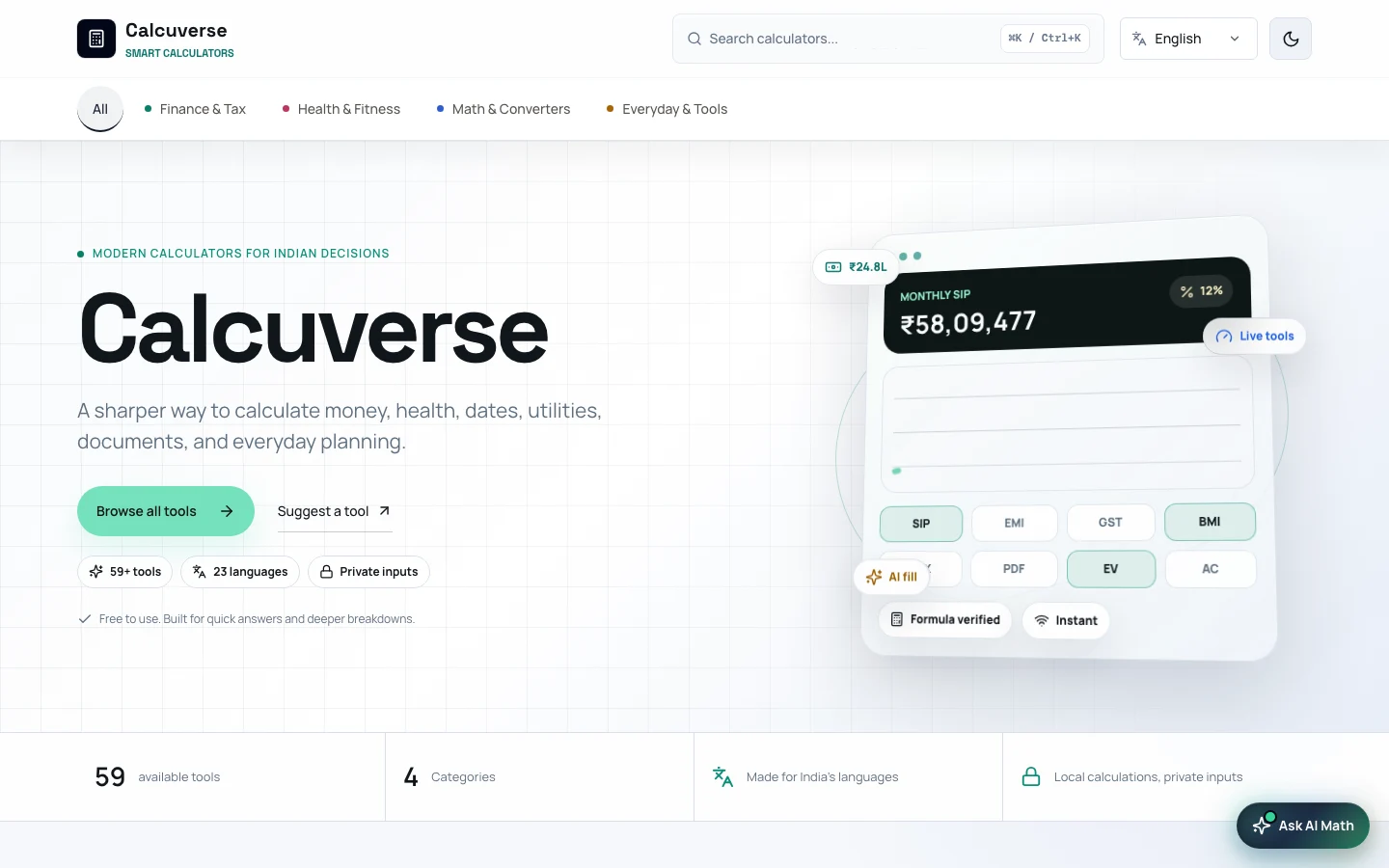
The homepage introduces the scope and gives browsing a direct starting point.
View screen ↗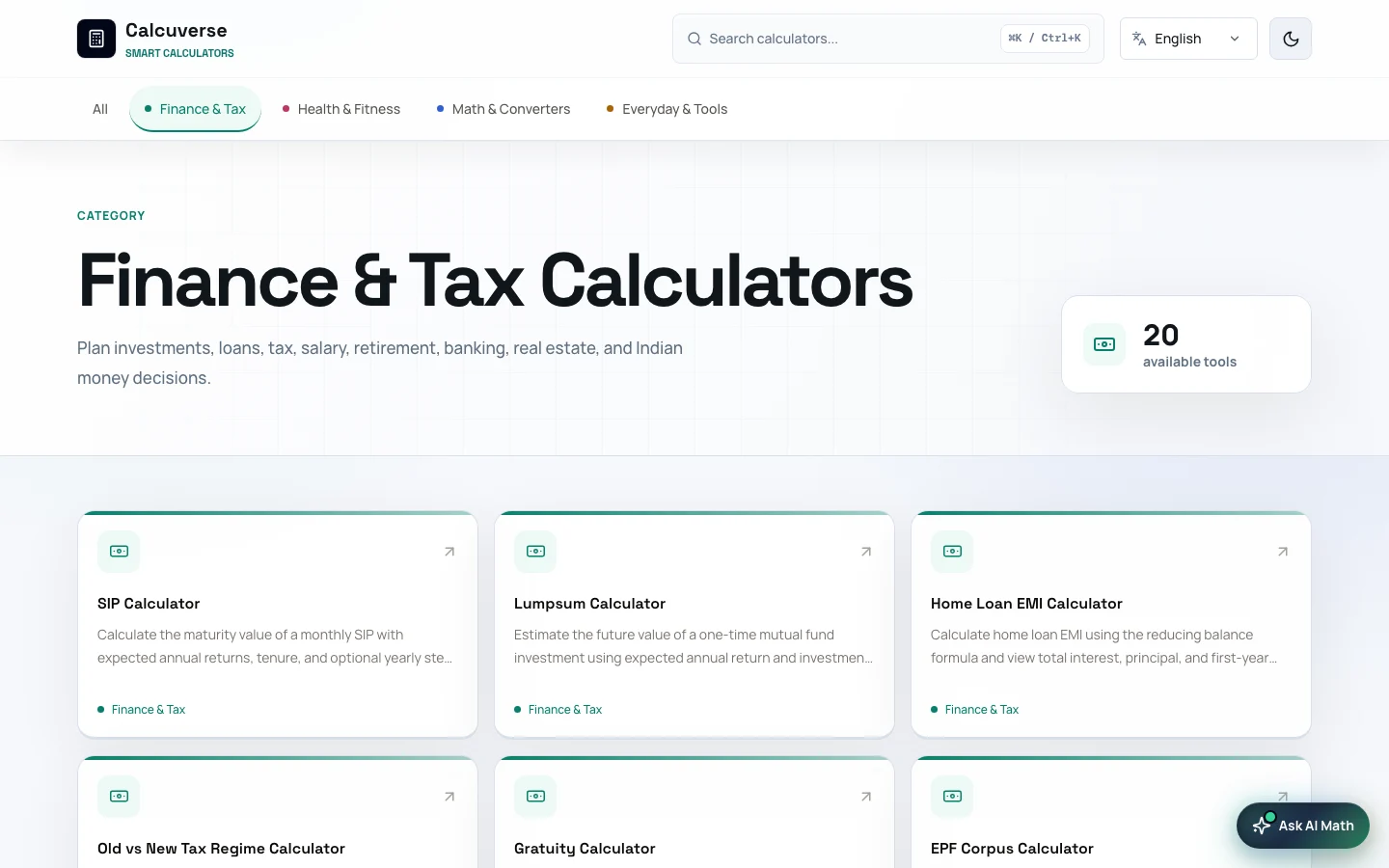
Tool cards describe the task before someone commits to opening it.
View screen ↗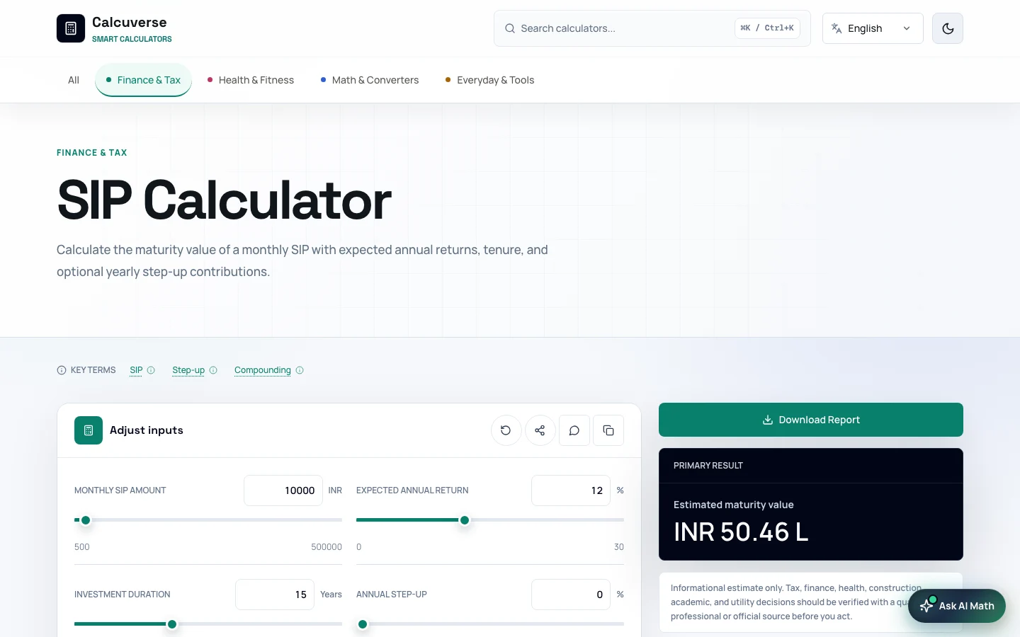
The SIP calculator pairs adjustable inputs with an estimate and supporting context.
View screen ↗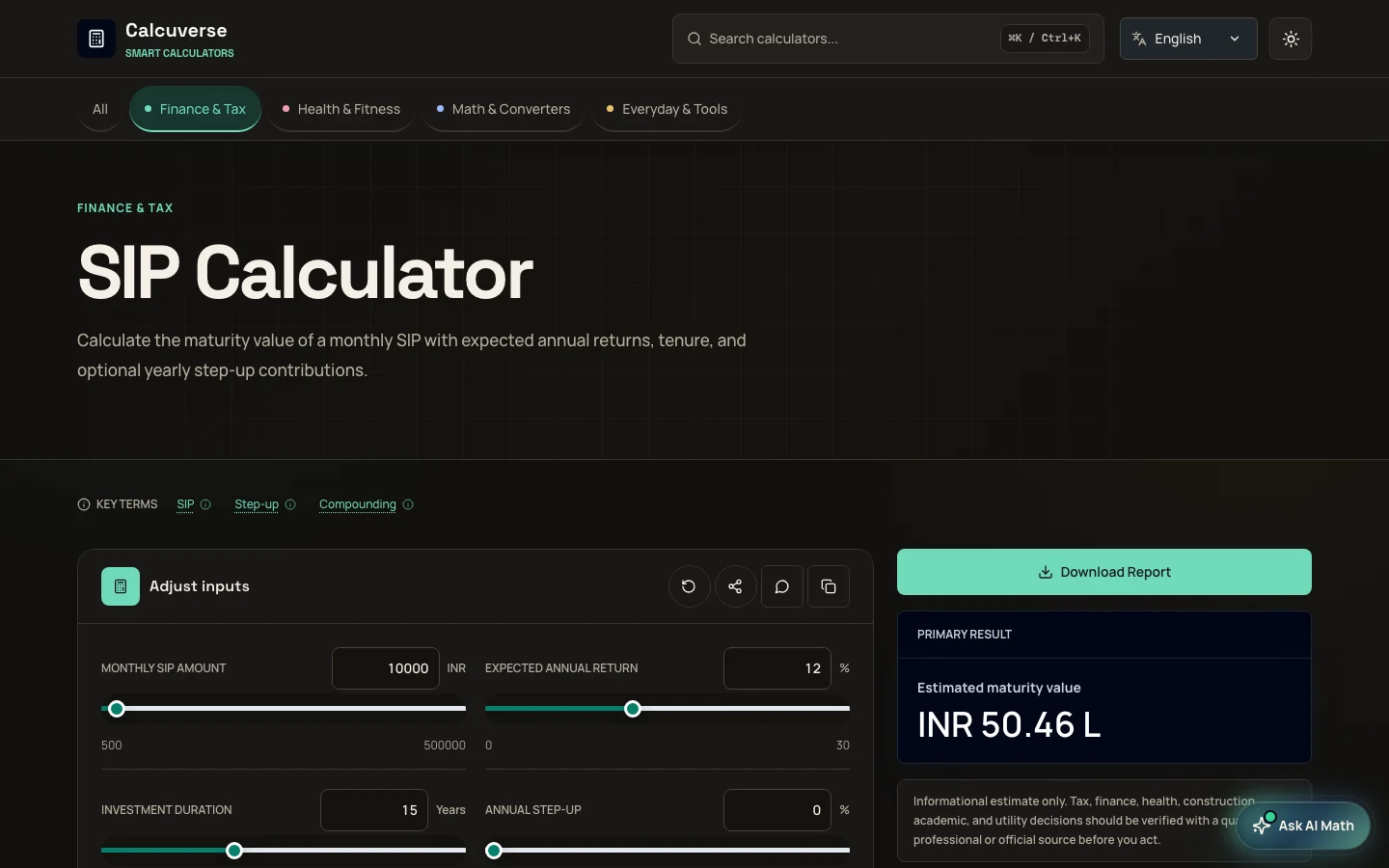
Dark surfaces preserve the separation between inputs, results, and supporting information.
View screen ↗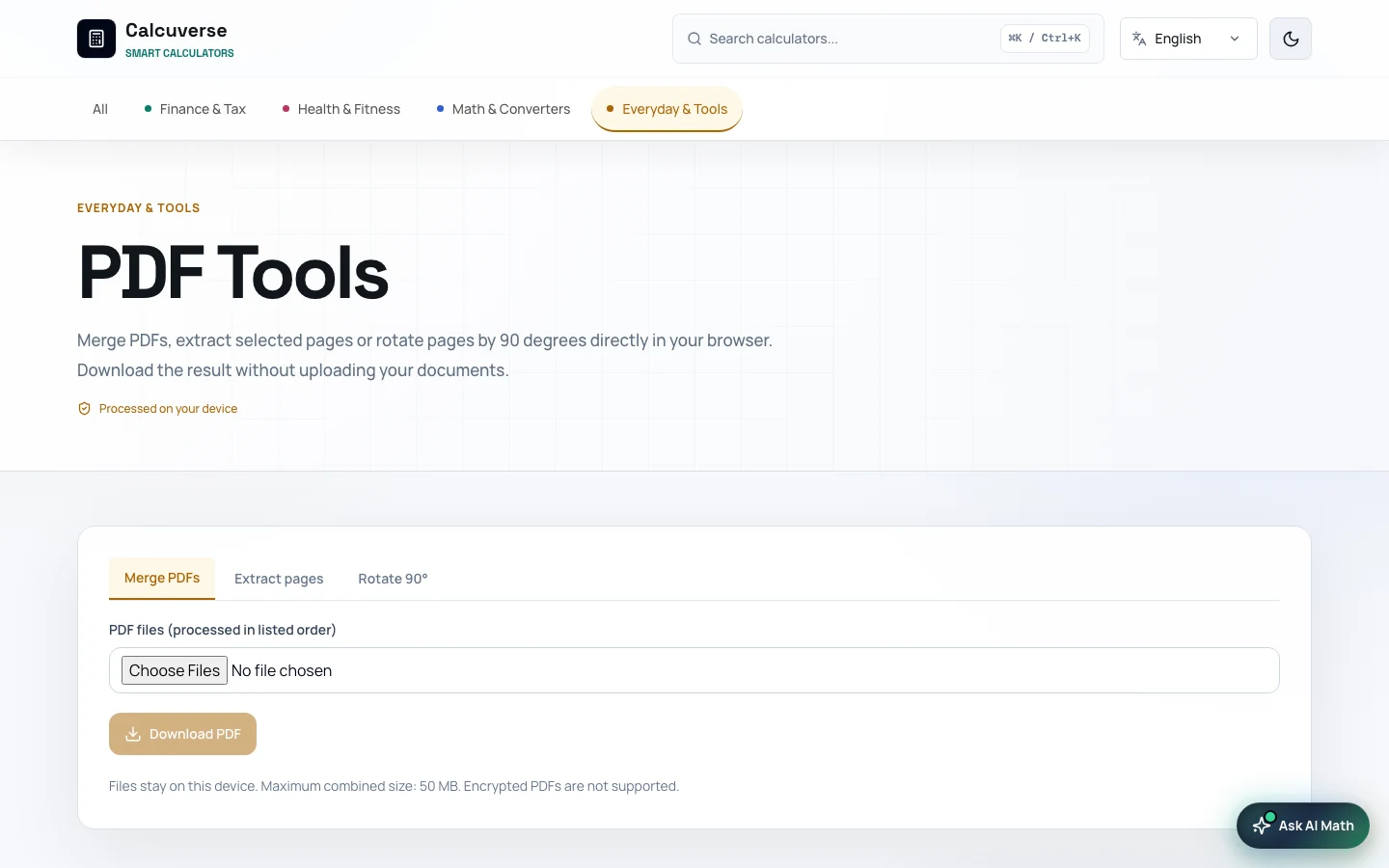
The PDF tool uses task and file controls within the shared application shell.
View screen ↗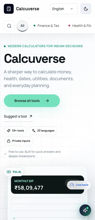
The introduction, categories, and primary action retain their order on a phone.
View screen ↗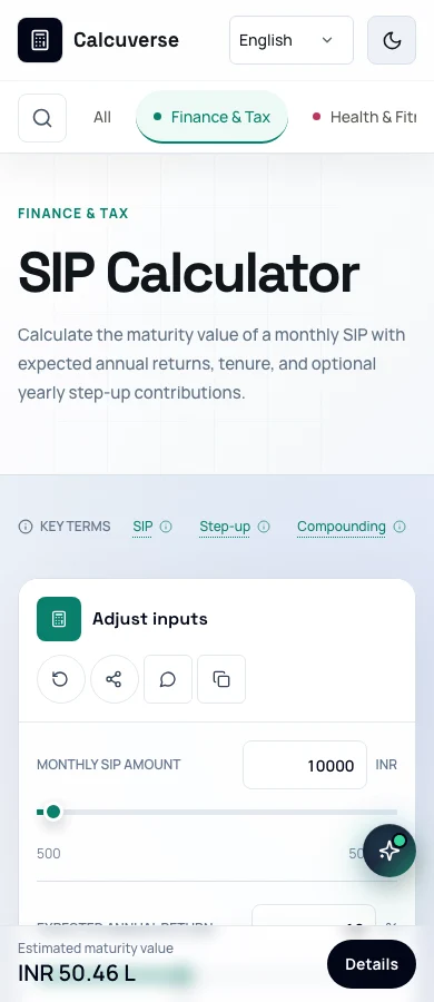
Inputs stack vertically while a result summary remains available at the bottom of the screen.
View screen ↗07 / DESIGN INTO DEVELOPMENT
I built the system behind the screens.
Calcuverse uses Next.js and React with a shared calculator catalogue, common input and result components, and dedicated workbenches. Calculator state handles defaults, value limits, reset behavior, and supported share links; reusable result views keep the presentation consistent.
The project also includes local calculation history, language dictionaries, theme controls, and PDF export for supported tools. Static export prepares the website for hosting. Keeping design and development in my own hands let me refine the actual behavior alongside the visual design.
The homepage in HTML
The original exported markup shows how the layout, navigation, category system, and typography come together.
08 / REFLECTION
The result is only one part of the experience.
Building the full product made the less visible design decisions just as important as the interface: sensible defaults, input limits, clear assumptions, predictable resets, and a useful route back to a tool.
My next priority is to keep the catalogue coherent as it grows. A new calculator should earn its place through a clear task and reliable behavior, rather than adding another card to the directory.